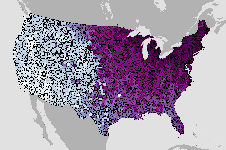
Does your location usually experience its coldest day of the year in early, mid, or late winter? Find an answer with this map based on weather observations between 1991-2020.
Does your location usually experience its coldest day of the year in early, mid, or late winter? Find an answer with this map based on weather observations between 1991-2020.
Use this interactive map to browse a collection of animated gifs showing monthly sea level at U.S. tide-monitoring stations over their lifetimes.
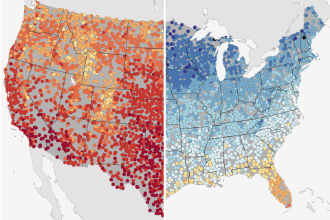
Based on historical climate data from thousands of stations across the United States, these maps show the warmest and coldest daytime high temperatures ever recorded at a given location on March 19—the astronomical first day of spring.
Costly and inconvenient, high-tide flooding of coastal communities is on the rise. Thanks to higher water levels from El Niño and sea level rise, the number of high-tide flood days in 2018 is projected to be 60% higher this year than would have been common around 2000. Find out what's predicted for your city in this interactive map.
If you define the start of winter as the arrival of the first snow, what's the earliest winter has arrived at the weather station nearest you?
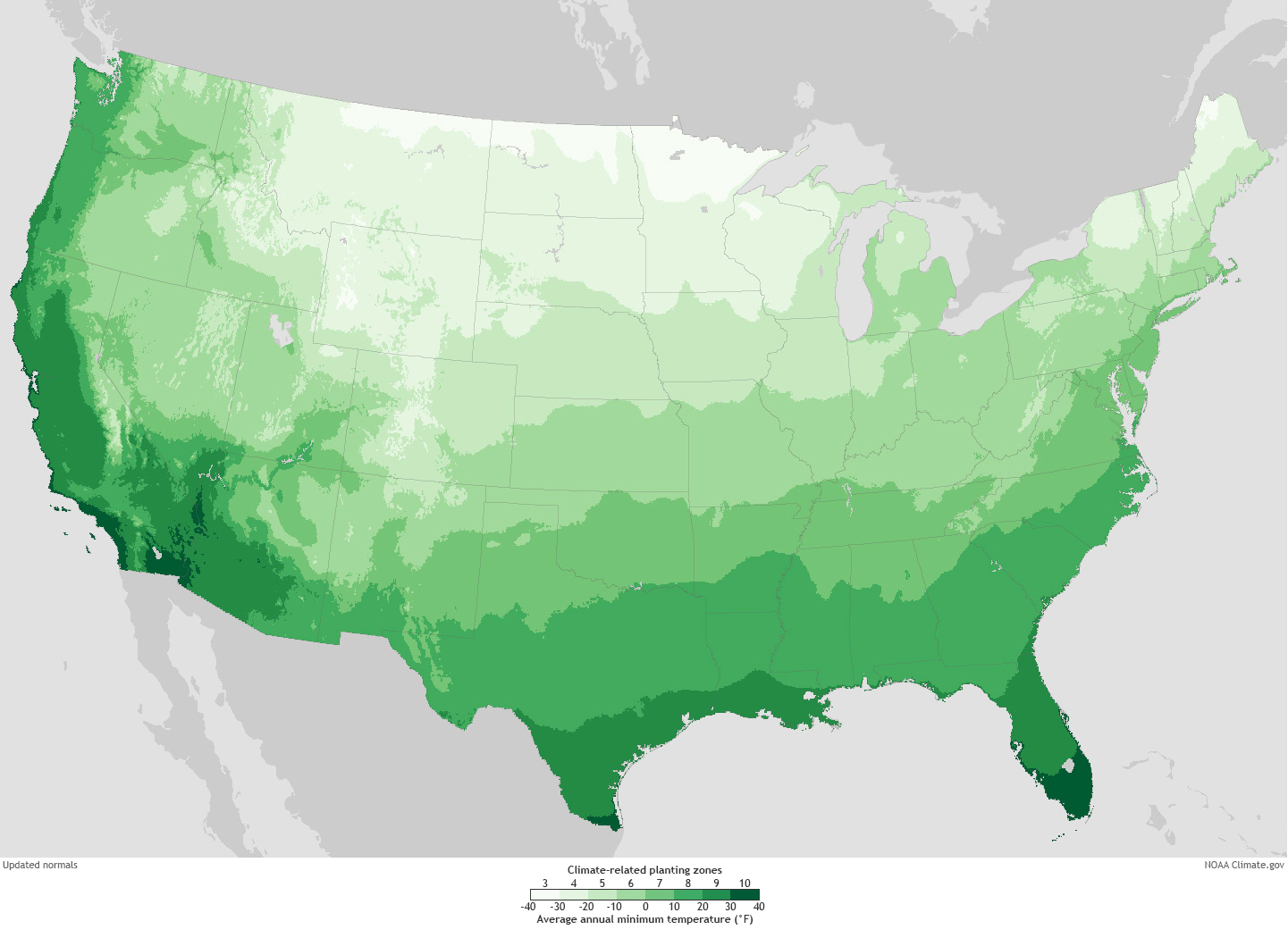
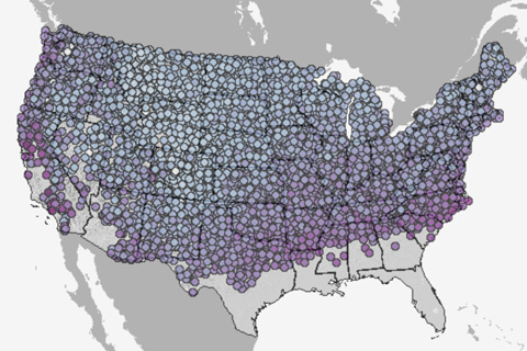
If you're planting a garden this spring, this set of maps based on U.S. climate data can help you see how planting zones across the country have shifted over the past few decades.
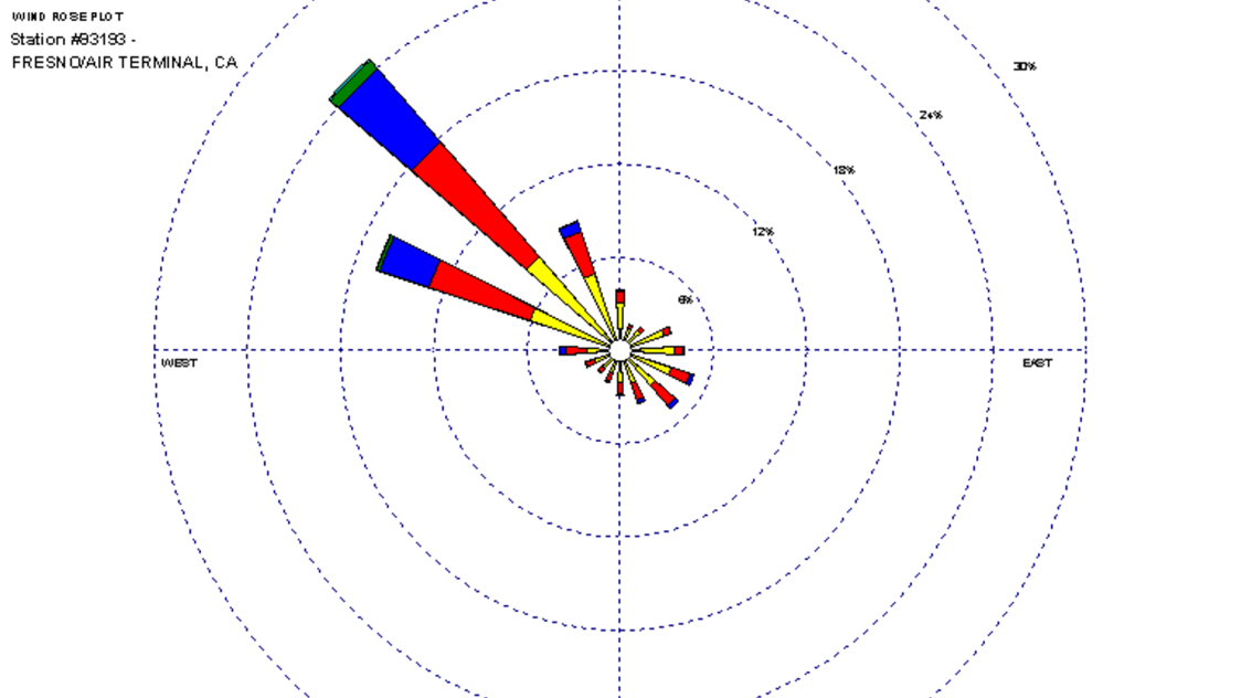
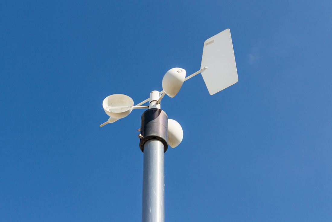
Monthly wind roses, which are plots that characterize the speed and direction of winds at a location, based on historical data.
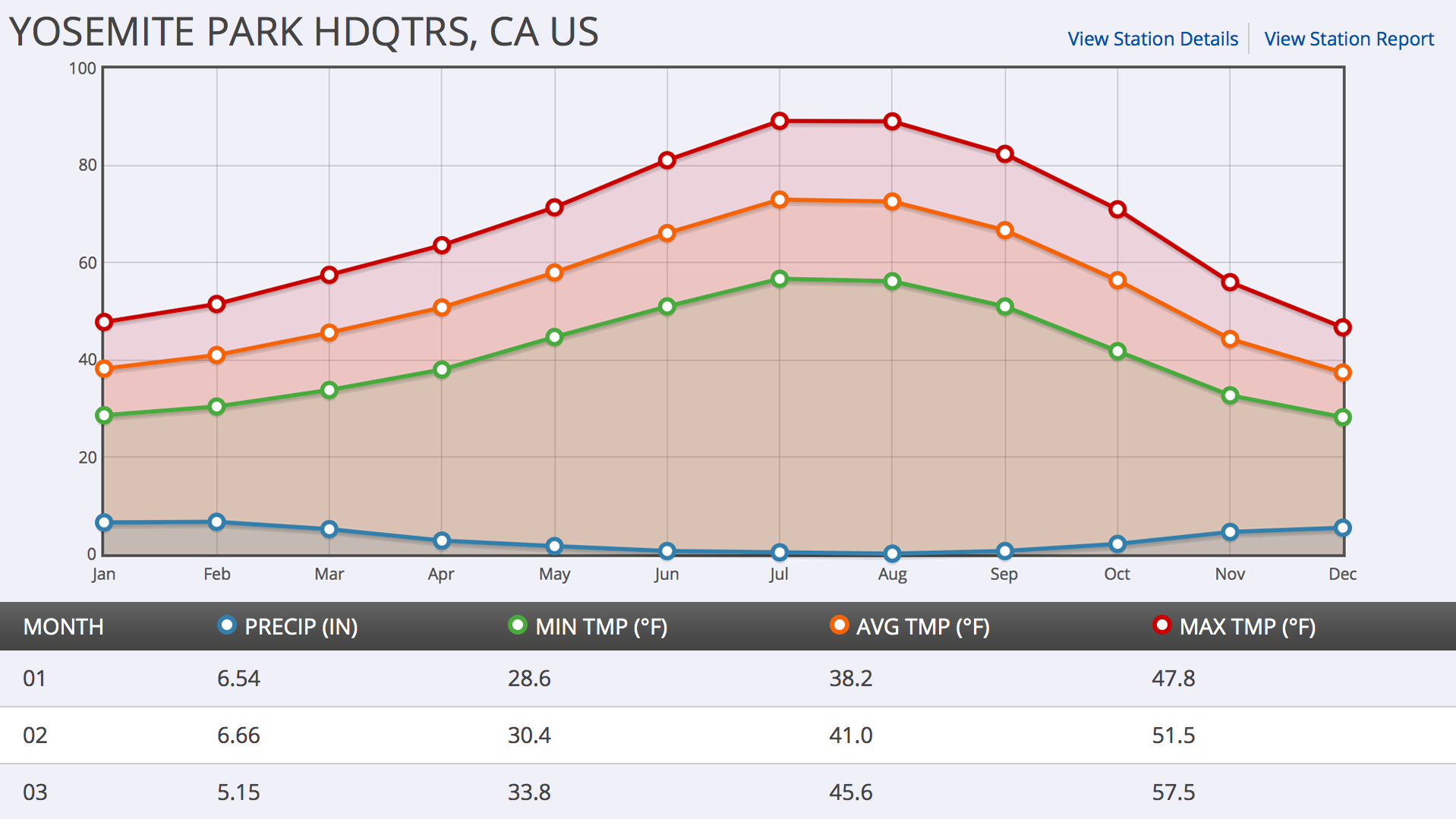
Simple graphs of Climate Normal data for temperature and precipitation are one way to show a location's climate throughout the year, month, or day.
This page describes some of the 50 Essential Climate Variables identified by the Global Climate Observing System (GCOS) for worldwide monitoring.
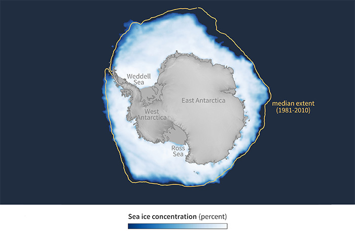
This collection includes monthly maps for sea ice concentration during the month of the Antarctic winter maximum extent—typically September, rarely October—dating back to the start of the satellite…