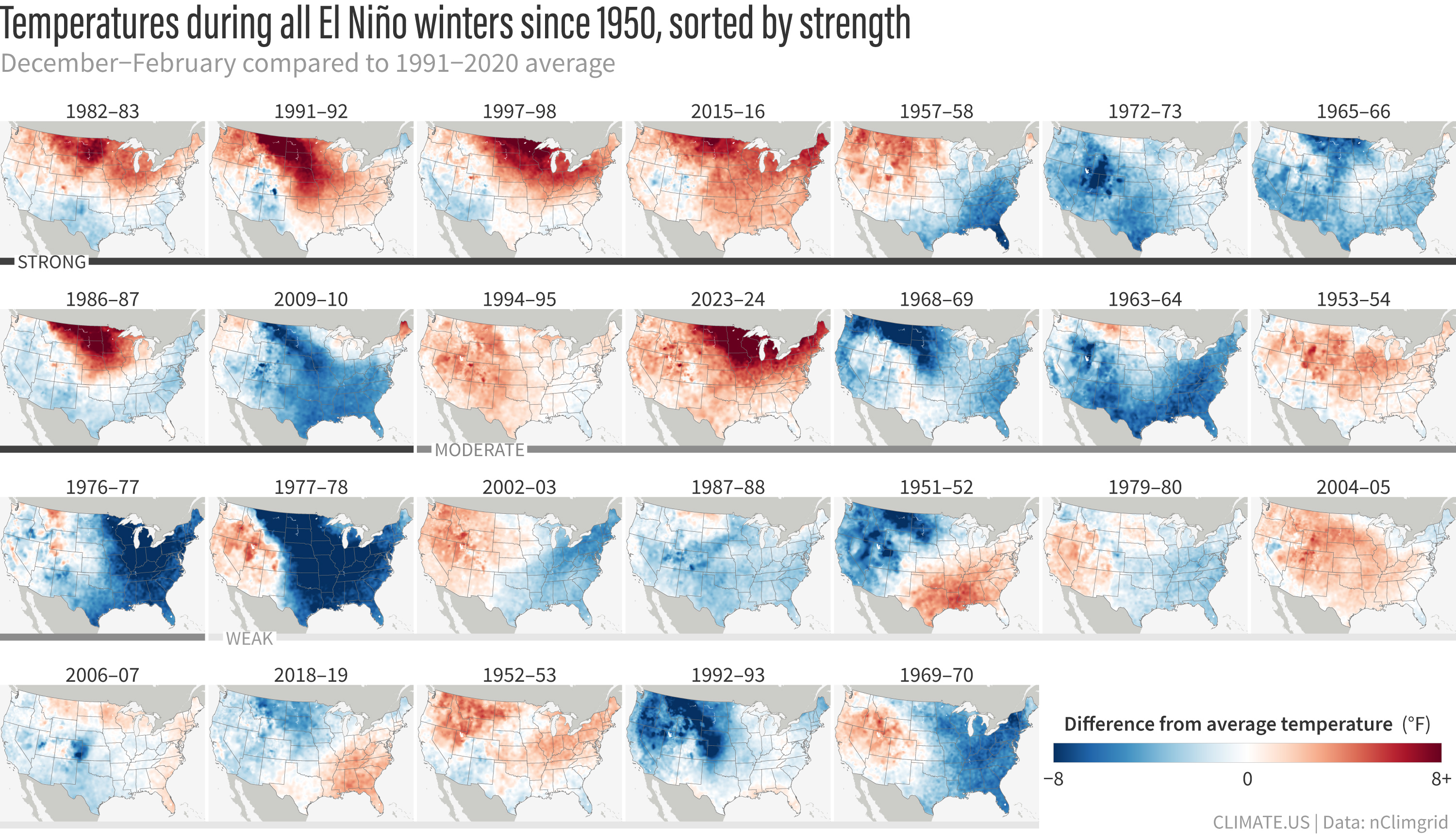
U.S. temperatures for every La Niña winter (December–February) since 1950 compared to the 1991–2020 average. Maps are ordered from strongest to weakest from upper left to bottom right based on the Relative Oceanic Niño Index value in December–February. Places that were warmer than average are red; places that were cooler than average are blue. These maps have not been de-trended to remove the influence of global warming on winter temperatures. Details and other formats. Climate.us image, based on NOAA nclimgrid data.