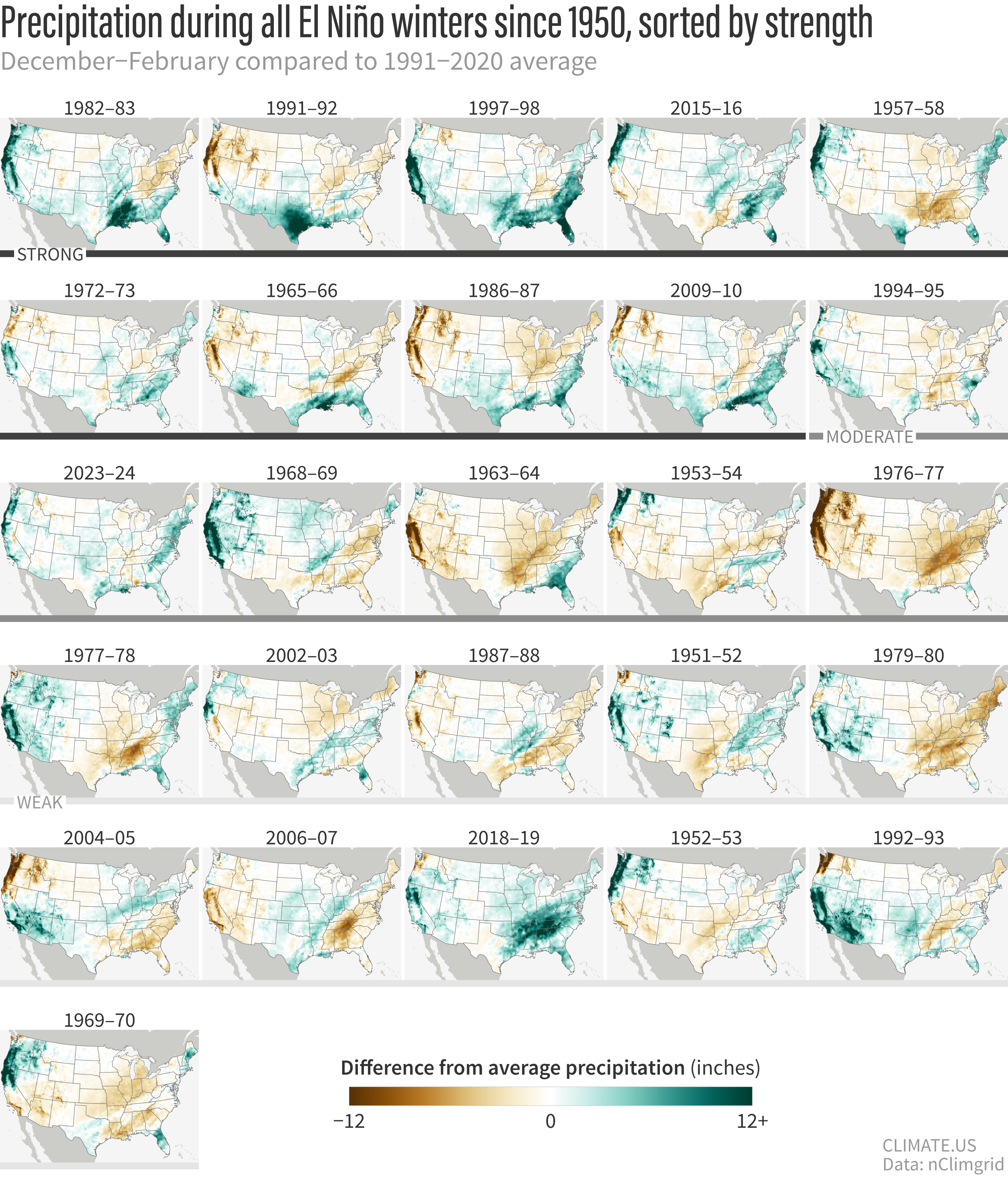
U.S. precipitation for every El Niño winter since 1950
Details
When the natural climate pattern El Niño develops in the tropical Pacific Ocean, it can affect areas thousands of miles away, including the United States. The effects are strongest in Northern Hemisphere winter. Check out these maps to see if El Niño has a reliable impact on the precipitation where you live.
These maps show winter precipitation (December-February) across the contiguous United States compared to the 1991-2020 average during all 26 El Niño winters since 1950. Maps are sorted from top left to bottom right based on the strength of the El Niño event in December-February. Places that were wetter than average over the winter are blue-green; places that were drier than average are brown. (Additional technical details are at the bottom of the post.)
A version of these maps was first published on our ENSO Blog as part of the 2015-16 winter outlook post by Mike Halpert, Deputy Director of NOAA's Climate Prediction Center. In the original post, Halpert wrote,
The most consistent signal is along the Gulf Coast, where almost all of the strong episodes were associated with greater-than-average precipitation. Other fairly reliable signals for the stronger events include a tendency for below-average precipitation in the Ohio and Tennessee Valleys and above-normal precipitation in southern California and the Southwest. Of course, these impacts are not ensured during every El Niño, not even the strongest ones.
For example, if we home in on South Carolina, the maps show that 6 out of 9 strong El Niño winters brought the state above-average precipitation. In Ohio, meanwhile, 7 out of the 9 strong El Niño years were modestly drier than average. If we combine all strong and moderate years, a pattern of dryness shows up in Colorado's Northern Rockies, although the exact frequency varies with the location.
These “failures” of the typical pattern happen because La Niña is never the only thing that influences the climate over the United States during the winter. Other climate phenomena, such as the Arctic Oscillation or the Madden Julian Oscillation, as well as the random variability of weather and climate also play a part in how a winter turns out.
This inherent variability is why climate forecasters always talk about seasonal climate outlooks in terms of "odds," "chances," or "probabilities"—not guarantees. You can read more about how to understand and use probabilistic forecasts in our ENSO Blog archives.
Technical details
A winter was considered an "El Niño winter" if it was colored red in NOAA's Relative Oceanic Niño Index (RONI) table. Years are sorted from strongest El Niño (top left) to weakest (bottom right)‚ based on the RONI value observed during December–February. For this graphic, events with RONI values greater than 1.5 were ranked as strong, events with RONI values between 1 and 1.5 were ranked as moderate, and events with RONI values less than 1 were ranked as weak. NOAA has recently started categorizing events with a peak RONI Index of more than 2 as "very strong". The first six maps in the sequence meet that threshold.
Maps by Climate.us based on NOAA nclimgrid data.