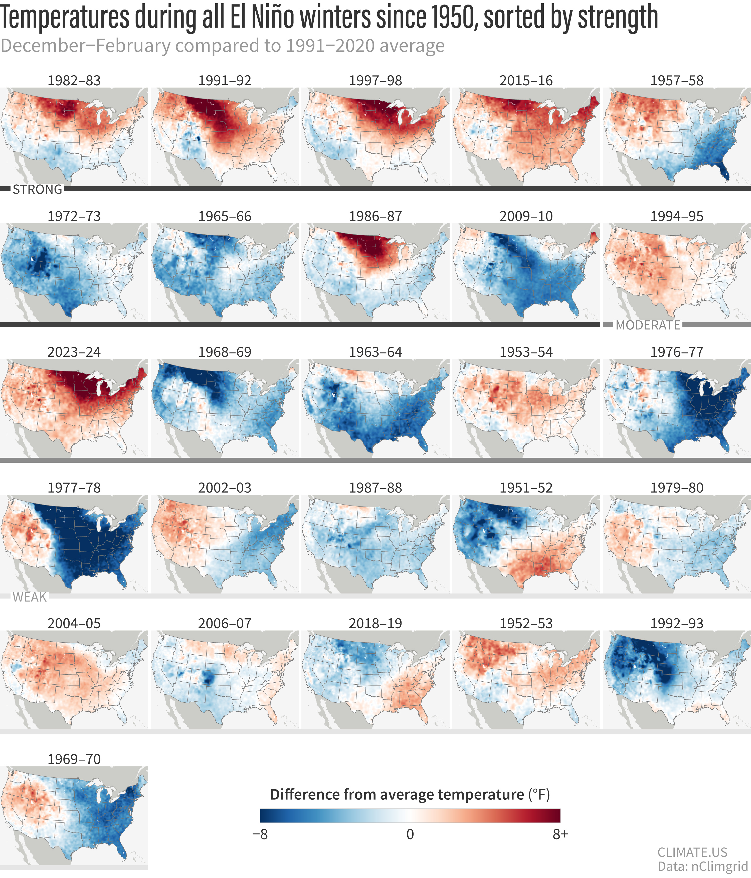
U.S. temperatures for every El Niño winter since 1950
Details
When the natural climate pattern El Niño develops in the tropical Pacific Ocean, it can affect areas thousands of miles away, including the United States. The effects are strongest in Northern Hemisphere winter. Check out these maps to see if El Niño has a reliable impact on the temperature where you live.
These maps show winter temperature (December-February) across the contiguous United States compared to the 1991-2020 average during all 26 El Niño winters since 1950. Maps are sorted from top left to bottom right based on the strength of the El Niño event in December-February. Places that were warmer than average over the winter are red; places that were cooler than average are blue. (Additional technical details are at the bottom of the post.)
There are a few important things you have to remember about the influence of El Niño and La Niña on U.S. seasonal climate.
- No two events are exactly the same.
- Strong events don't guarantee strong impacts; they just make it more likely that some level of impacts will occur.
- La Niña and El Niño have a weaker influence on temperature than precipitation.
The typical U.S. impacts of El Niño include cooler- and wetter-than-average conditions across the southern tier of the United States, warmer-than-average conditions across much of the North, and drier-than-average conditions in the Ohio Valley. "Typical" doesn't mean "always," though, as the maps show.
Six out of the nine strong events brought warmer-than-average winter temperatures across the northern part of the country, but even among them, the geographic details—the location of the biggest anomalies, where the few cool spots are—varied from one event to another. The typical cooling influence in the South can be harder to spot (these images have not been de-trended to account for the influence of global warming), but if you focus on Texas, you can see that it was cooler than average in 9 out of the 15 total strong and moderate events.
These “failures” of the typical pattern happen because La Niña is never the only thing that influences the climate over the United States during the winter. Other climate phenomena, such as the Arctic Oscillation or the Madden Julian Oscillation, as well as the random variability of weather and climate also play a part in how a winter turns out.
This variability from one El Niño to the next is one reason why CPC scientists always talk about seasonal climate outlooks in terms of "odds," "chances," or "probabilities"—not guarantees. You can read more about how to understand and use probabilistic forecasts in our ENSO Blog archives.
Technical details
A winter was considered an "El Niño winter" if it was colored red in NOAA's Relative Oceanic Niño Index (RONI) table. Years are sorted from strongest El Niño (top left) to weakest (bottom right)‚ based on the RONI value observed during December–February. For this graphic, events with RONI values greater than 1.5 were ranked as strong, events with RONI values between 1 and 1.5 were ranked as moderate, and events with RONI values less than 1 were ranked as weak. NOAA has recently started categorizing events with a peak RONI Index of more than 2 as "very strong". The first six maps in the sequence meet that threshold.
Maps by Climate.us based on NOAA nclimgrid data.