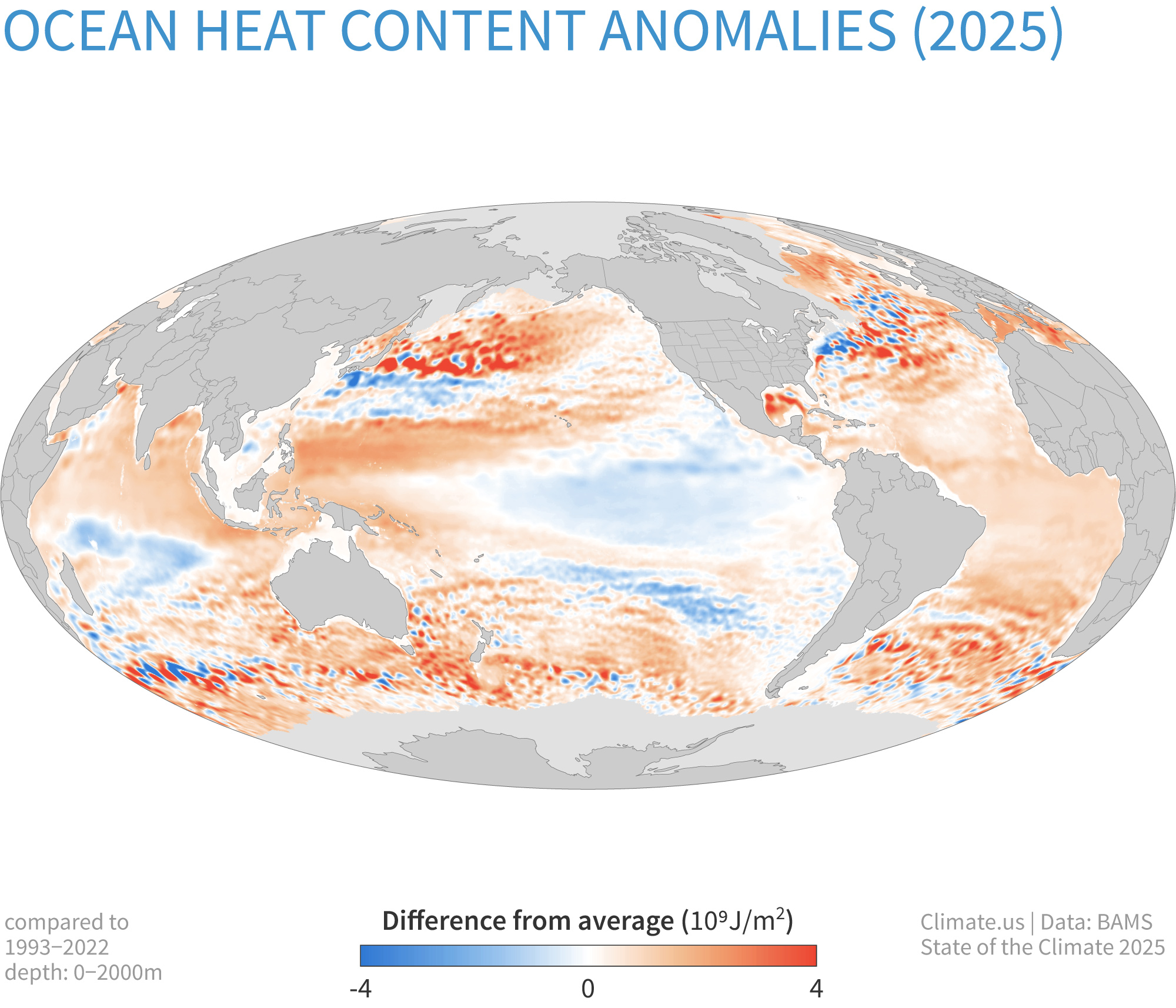
Global map of ocean heat content in the upper 2,000 meters (1.2 miles) of the ocean in 2025 compared to the 1993-2022 average. More places are warmer than average (orange) than cooler (blue). Adapted from Figure 3.5a in State of the Climate 2025 from the American Meteorological Society.