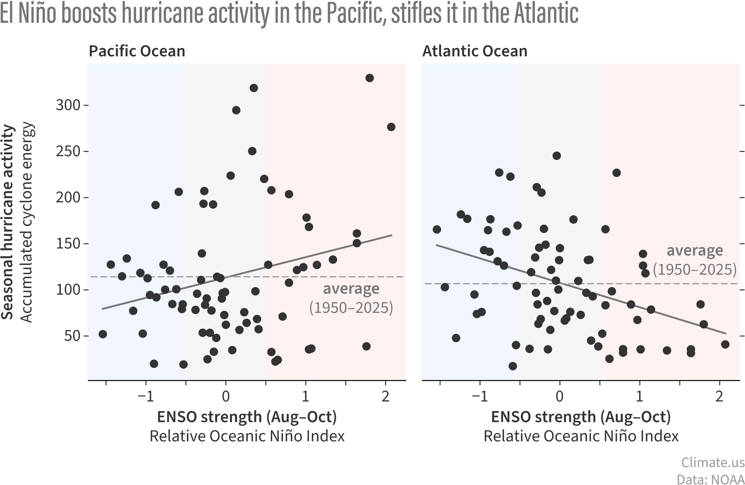
Each dot on these graphs shows seasonal hurricane activity versus the ENSO strength during August–October—the peak of hurricane season—for all hurricane seasons from 1950–2025. The higher the dot, the more active the season, as measured by the Accumulated Cyclone Energy (ACE) Index. The dashed lines show the average ACE for each basin. During El Niño years (red shading), there are more dots, meaning more seasons, above the average line than below it in the Pacific. In the Atlantic (right-hand graph), it's the opposite; more dots below average than above. Climate.us graphic, based on NOAA data.