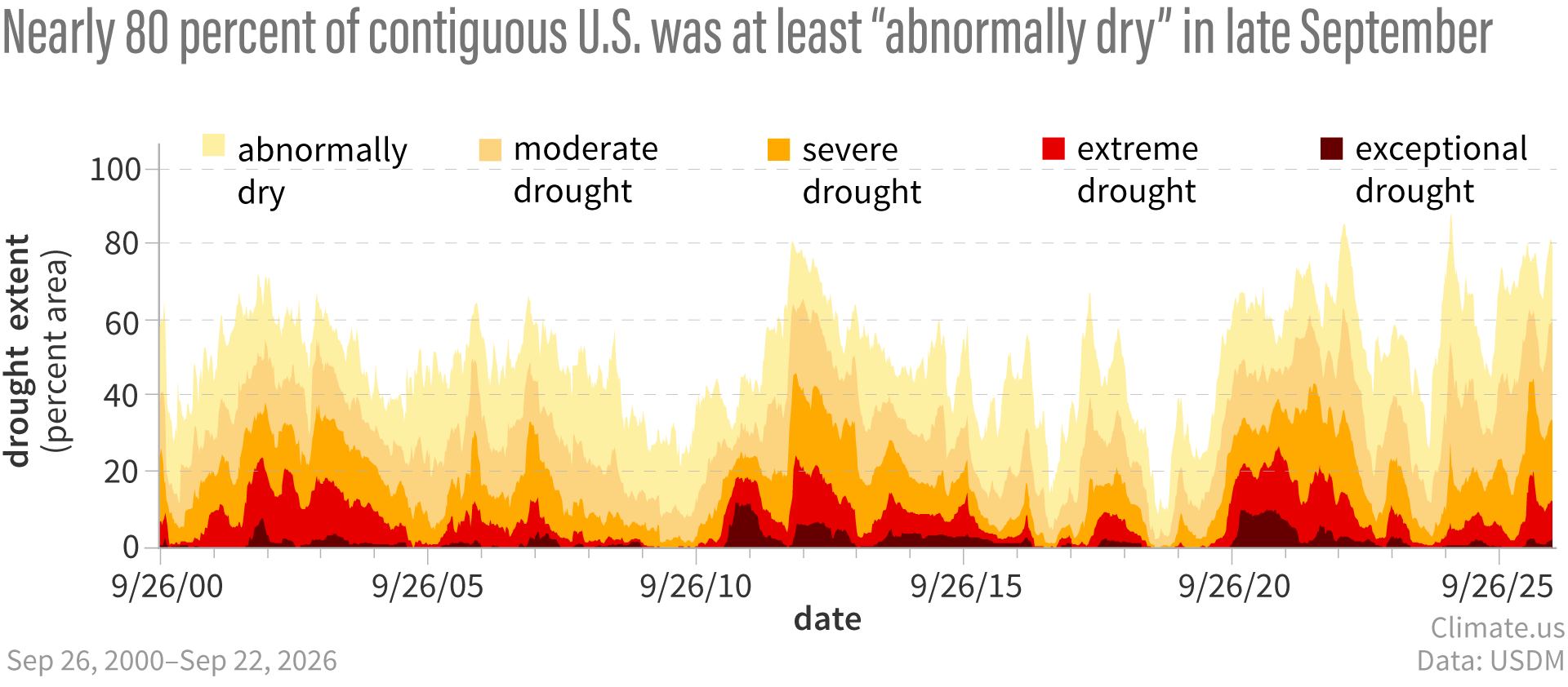
This graph shows the cumulative percent area of the contiguous United States in different categories of drought. Darkest red shows the area in exceptional drought. Bright red is the total area in at least extreme drought (extreme plus exceptional), and so on through severe drought (dark orange) and moderate drought (light orange.) Although the total area in exceptional drought at the end of September 2026 was relatively small compared to conditions in 2010–2015 and 2020, the total area at least abnormally dry (yellow) was significant. Climate.us graph, based on data from the U.S. Drought Mitigation Center.