U.S. temperature, precipitation, and drought outlook maps for September 2026
The first month of fall is here, although you’d be excused for doubting the calendar if you live in parts of the central and eastern United States. On September 2, 2026, NOAA’s Weather Prediction Center warned that “[d]angerous heat” was present over the central and southern Great Plains and the South, and that it would build in the Midwest and Mid-Atlantic by later in the week. Meanwhile, as drought continues across much of the West, portions of Texas were getting soaked by the remnants of Tropical Depression Edouard, prompting NOAA to warn of a moderate risk (level 3 out 4) of excessive rainfall there. Both the heat and the heavy rain have factored into NOAA’s monthly climate outlook for September, which we show in the maps below.
![d]angerous heat](https://www.wpc.ncep.noaa.gov/key_messages/LatestKeyMessage_1.png)
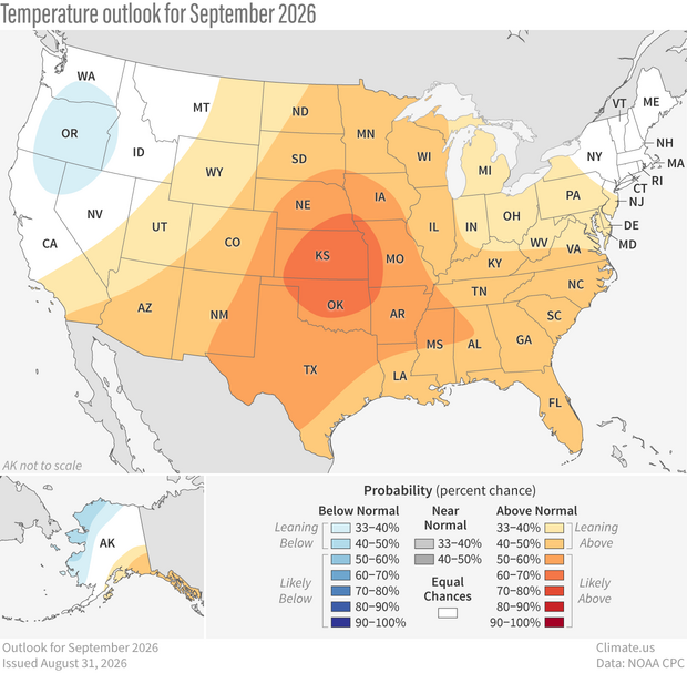
NOAA temperature outlook for September 2026. Any red/orange area means a warmer-than-average September is more likely than a cooler-than-average one. Any blue area means the opposite. Darker colors mean higher chances, not bigger temperature extremes. White areas mean that a warm, cool, or near-average September is equally likely. See text forecast for Hawaii. Climate.us maps, based on data from the Climate Prediction Center.
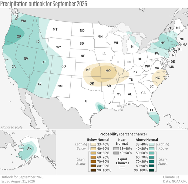
NOAA precipitation outlook for September 2026. Any green area means a much wetter than average September is more likely than a much drier one. Any brown area means the opposite. Darker colors mean higher chances, not bigger precipitation extremes. White areas mean that a wet, dry, or average September is equally likely. See text forecast for Hawaii. Climate.us maps, based on data from the Climate Prediction Center.
The maps do not predict the actual temperature or rainfall amounts for the month. They show the probability (percent chance) that September average temperature or precipitation is likely to be well above or well below average. (Well above and well below mean in the top or bottom third of the temperature and precipitation values on record for Septembers from 1991-2020. For more details on the math behind these maps and how to interpret them, see our explainer.)
In other words, the maps below answer the questions, what climate outcome—well above, well below, or near average—is most likely, and how likely? On the temperature map, any shade of orange/red means a much warmer than average September is more likely than a much colder than average September. On the precipitation map, any shade of green means a much wetter than average September is more likely than a much drier than average one. (See text forecast for Hawaii).
The highest chances for a much warmer than average September are in the heart of the Southern Great Plains, where forecasters place the odds at between 60–70 percent. Although odds are lower elsewhere, most of the rest of the “CONUS” (short for contiguous United States) is at least leaning toward a warm September, meaning odds above 33 percent. The only parts of the country where the odds favor a much cooler than average September are parts of the Pacific Northwest and the west coast of Alaska.
Across the West, a wet September is more likely than a dry one, but only slightly so. The odds mostly range from 33 percent chance to just under 50 percent, which NOAA describes as “leaning” wet. (They hold off using “likely” until the percent chances rise above 50 percent). Given the severity of drought out west, however, any chance of relief is likely to be seen as good news for those in that region. The map below shows NOAA’s drought outlook for September, which has improvement forecasted for parts of Oregon and the Southwest.
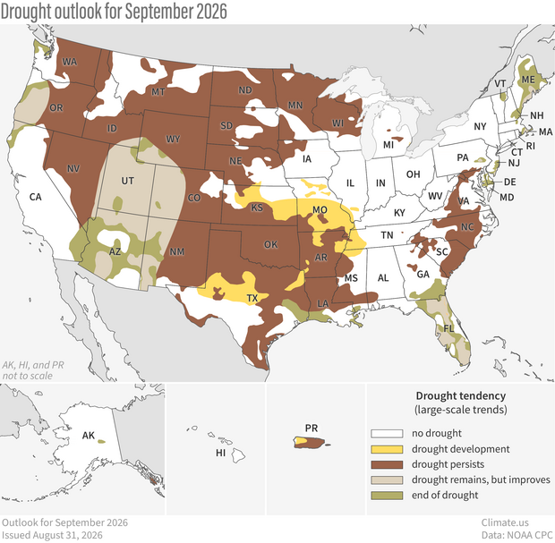
U.S. map of predicted drought conditions in September 2026. Climate.us map, based on data from the Climate Prediction Center (CPC).
Useful links
- Monthly and seasonal climate outlooks from NOAA Climate Prediction Center.
- An explainer on how to interpret NOAA’s monthly and seasonal climate outlooks.
- Monthly maps of 1991-2020 average U.S. temperature (average, minimum, and maximum) and precipitation.
- Future September temperatures in coming decades if human-produced greenhouse gas emissions peak by mid-century and at least stabilize or decline gradually after that.
- Climate statistics from NOAA National Centers for Environmental Information.