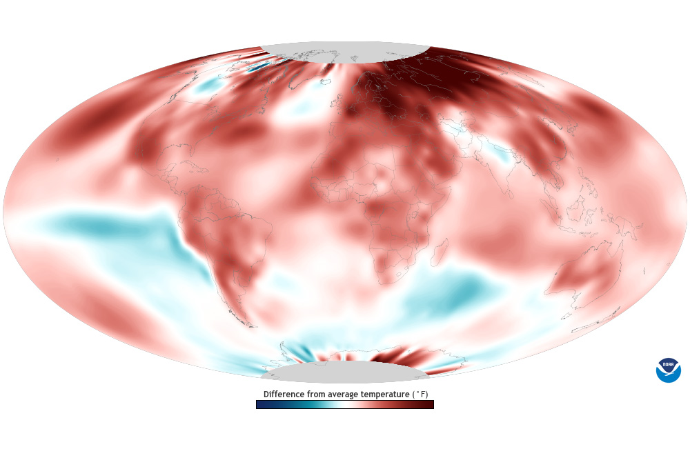
Colors show where average annual temperature was above or below its 1991-2020 average. Blue areas experienced cooler-than-usual temperatures for the year while areas shown in red were warmer than…
Colors show where average annual temperature was above or below its 1991-2020 average. Blue areas experienced cooler-than-usual temperatures for the year while areas shown in red were warmer than…
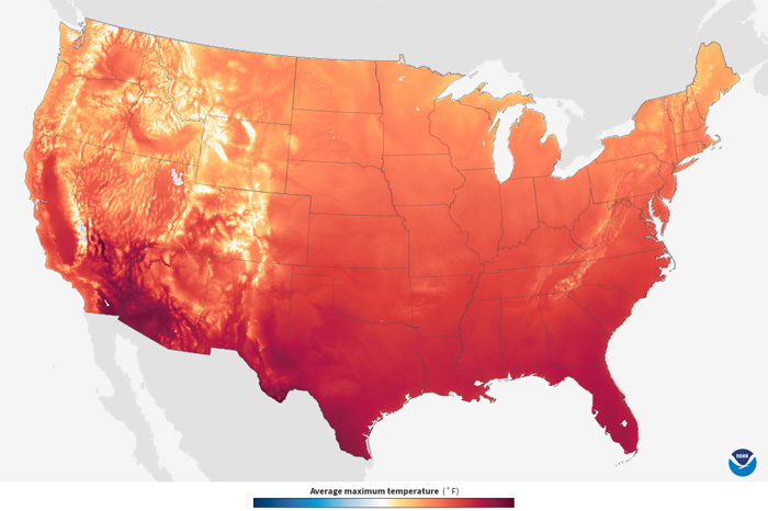
Based on daily observations from 1991-2020, colors on the map show the long-term average maximum temperature, sometimes referred to as the daytime or afternoon high, in 5x5 km grid cells for the…
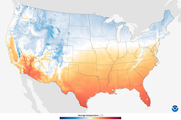
Based on daily observations from 1991-2020, colors on the map show the long-term average mean temperature in 5x5 km grid cells for the month displayed. The maps show mean temperatures—the arithmetic…
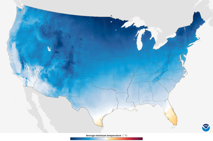
Based on daily observations from 1991-2020, colors on the map show the long-term average minimum temperature, sometimes referred to as “the overnight low,” in 5x5 km grid cells for the month…
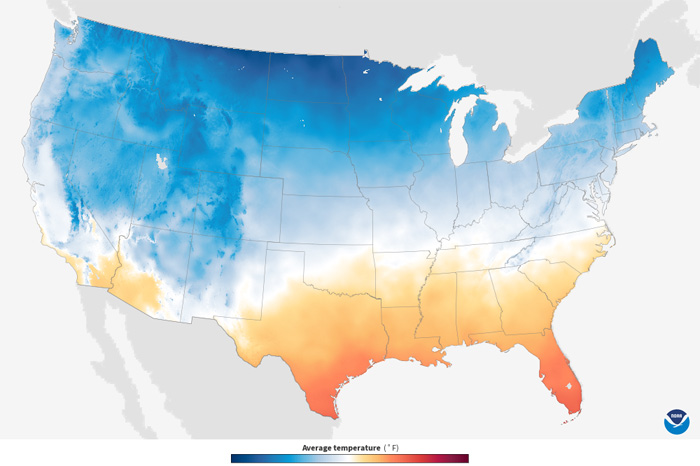
Colors show the average monthly temperature across the contiguous United States. White and very light areas had average temperatures near 50°F. Blue areas on the map were cooler than 50°F; the darker…
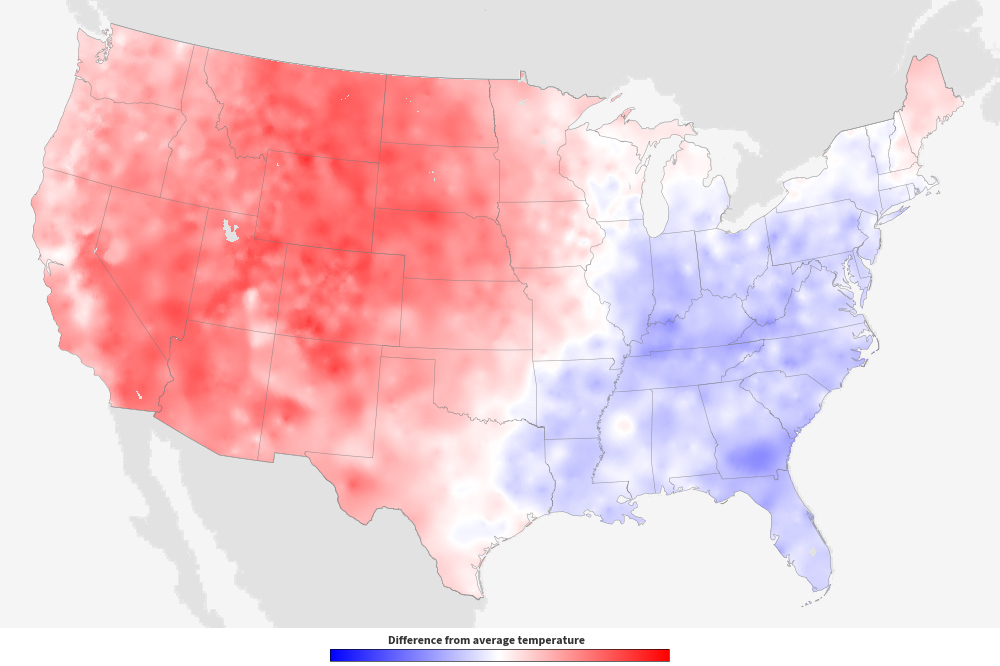
Colors show where and by how much the monthly average temperature differed from the month’s long-term average temperature from 1991-2020. Red areas were warmer than the 30-year average for the month,…
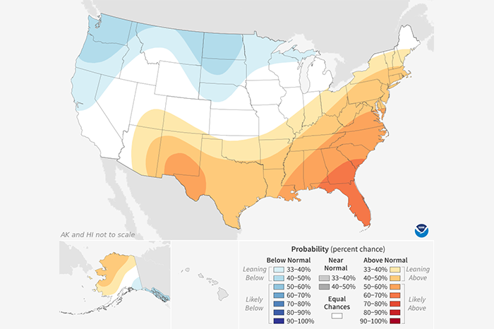
Shaded areas show where average temperature has an increased chance of being warmer or cooler than usual. The darker the shading, the greater the chance for the indicated condition. White areas have…
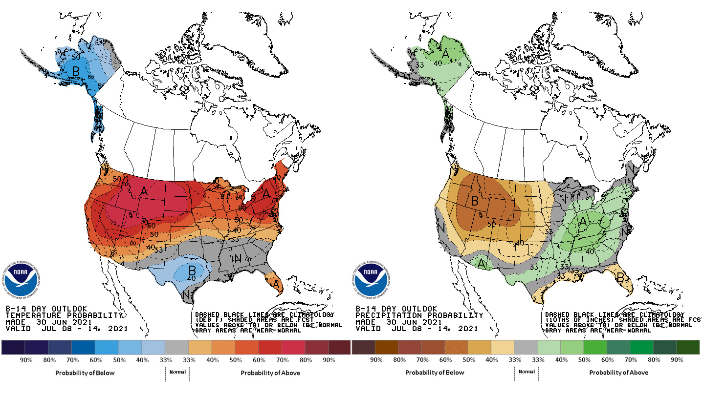
Climate outlook maps describe the chances that conditions will be below-normal, near-normal, or above-normal for the future outlook period indicated.
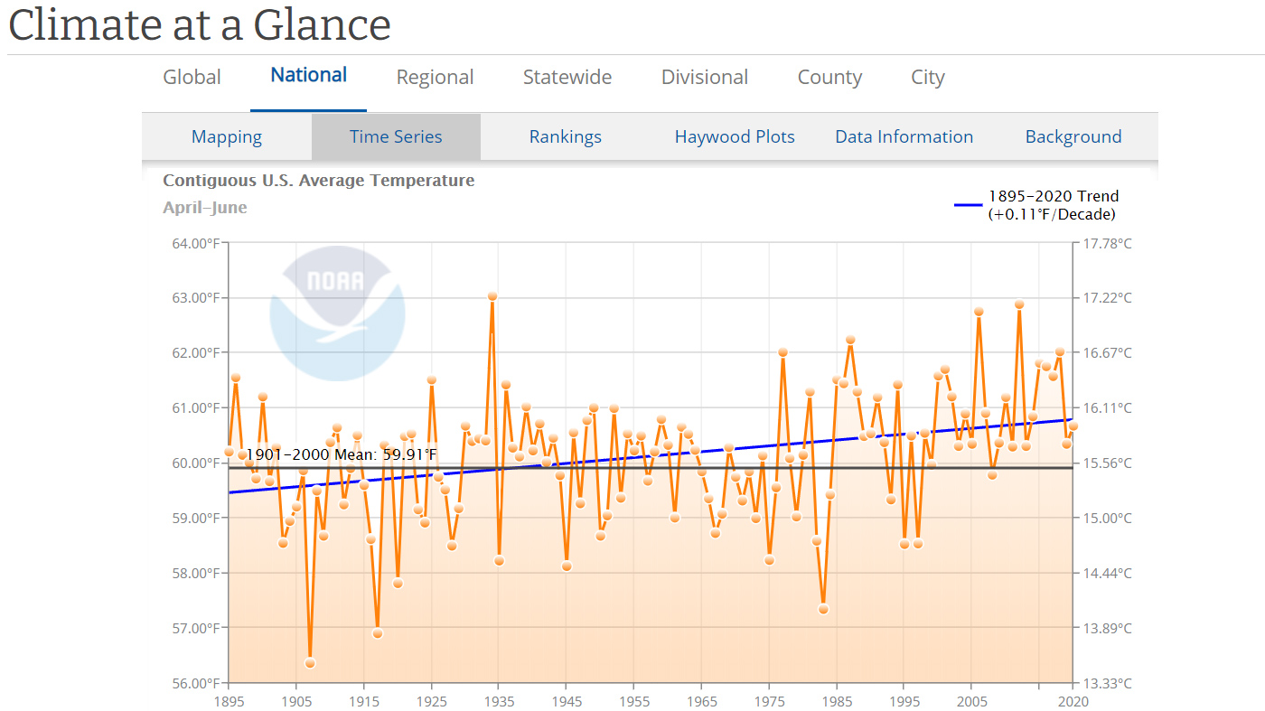
Historical records of U.S. temperature and precipitation as graphs, giving you a way to see how they have changed over time.
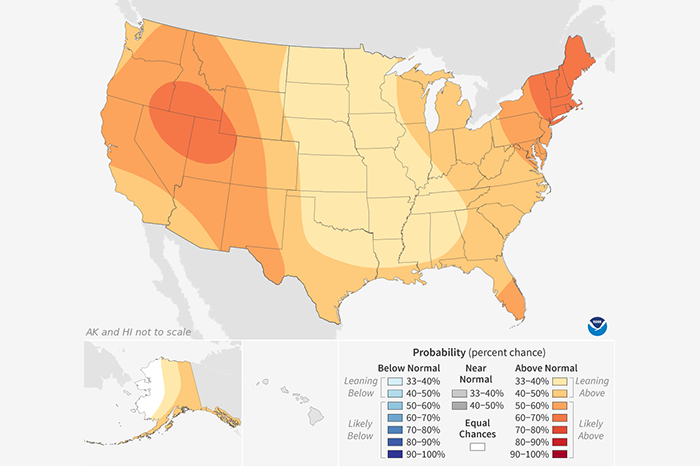
Shaded areas show where average temperature has an increased chance of being warmer or cooler than usual. The darker the shading, the greater the chance for the indicated condition. White areas have…