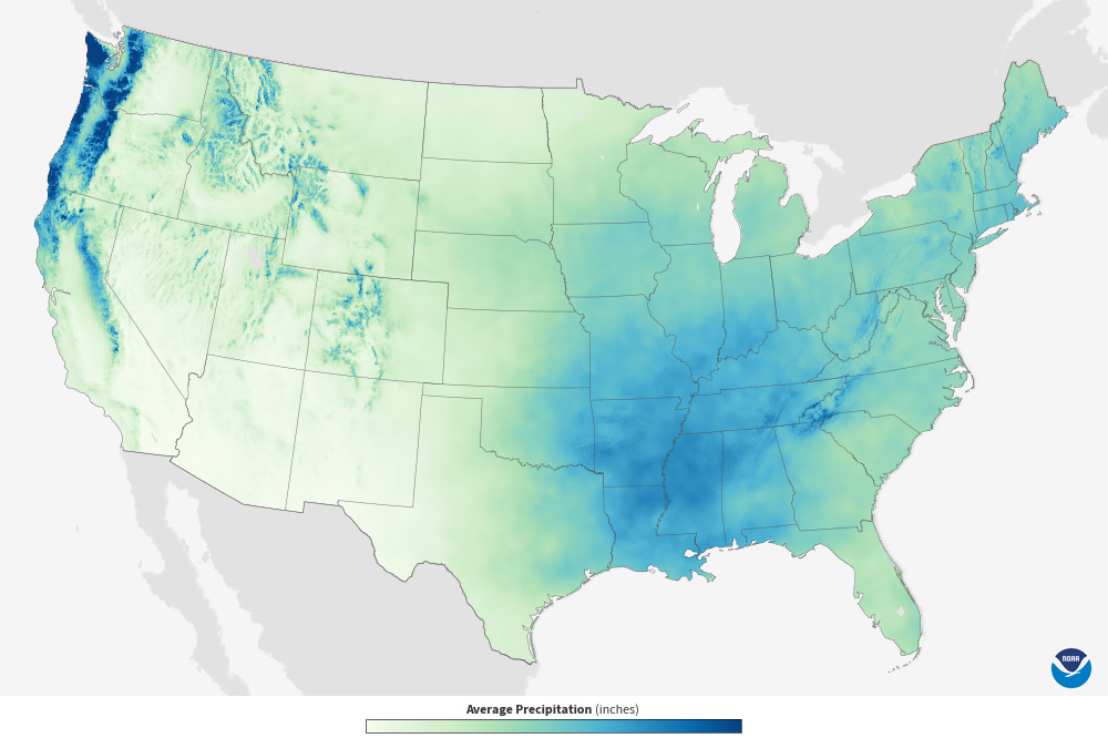
Based on daily observations from 1991-2020, colors on the map show long-term average precipitation totals in 5x5 km grid cells for the month displayed. The darker the color, the higher the total…
Based on daily observations from 1991-2020, colors on the map show long-term average precipitation totals in 5x5 km grid cells for the month displayed. The darker the color, the higher the total…
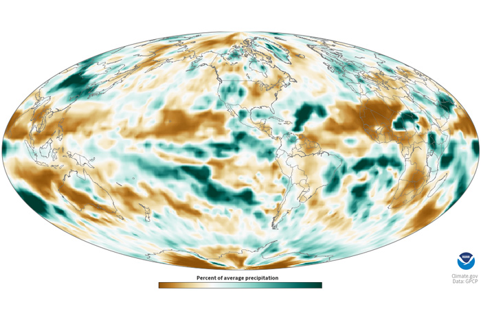
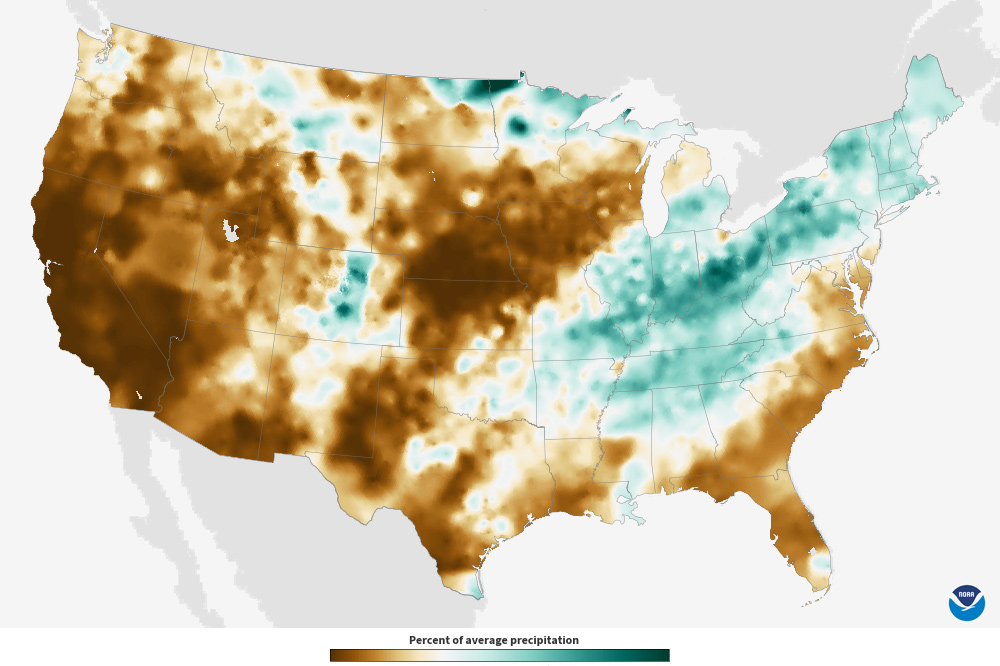
Colors show what percent of its average precipitation a location received in a specific month. White and very light areas had monthly precipitation totals close to the long-term average. Brown areas…
Colors show where total precipitation has an increased chance of being higher or lower than usual during the next month. The darker the shading, the greater the chance for the indicated condition…
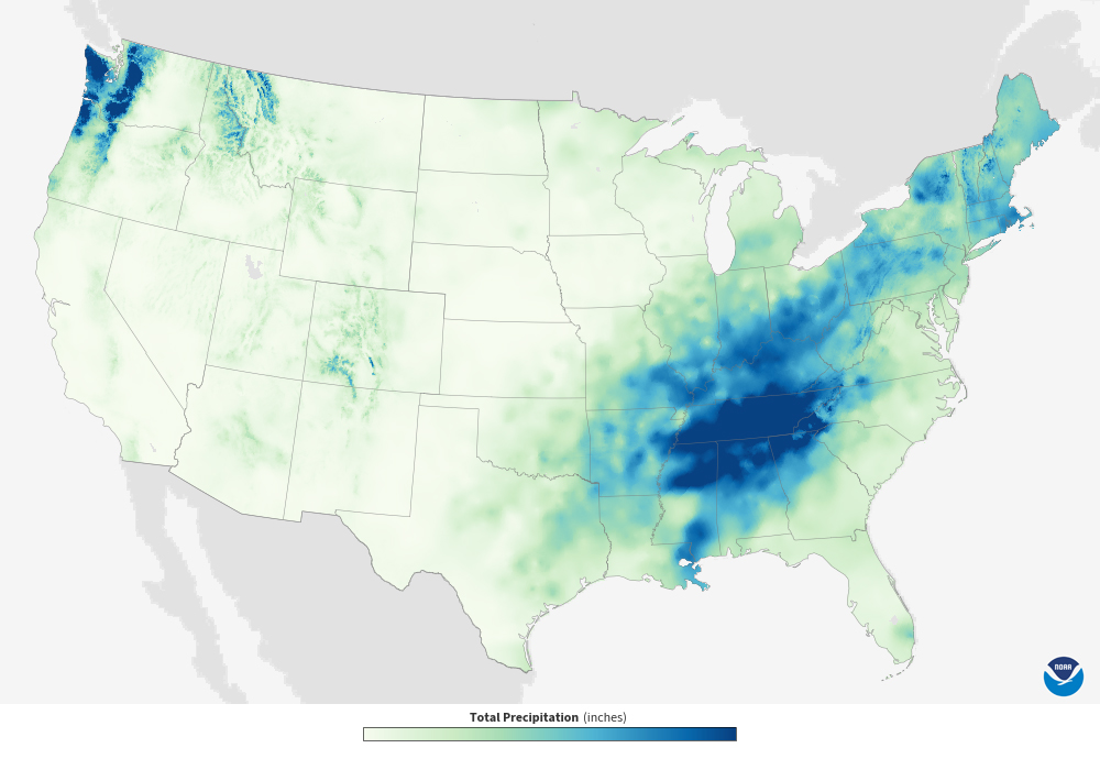
Colors show monthly precipitation totals across the contiguous United States. The darker the color, the higher the total precipitation.
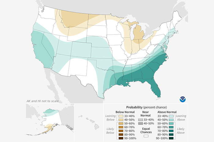
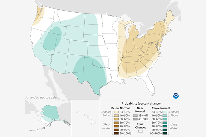
Colors show where total precipitation has an increased chance of being higher or lower than usual during the next three months. The darker the shading, the greater the chance for the indicated…
Colors show where and by how much monthly precipitation totals differed from average precipitation for the same month from 1991-2020. Green areas were wetter than the 30-year average for the month…
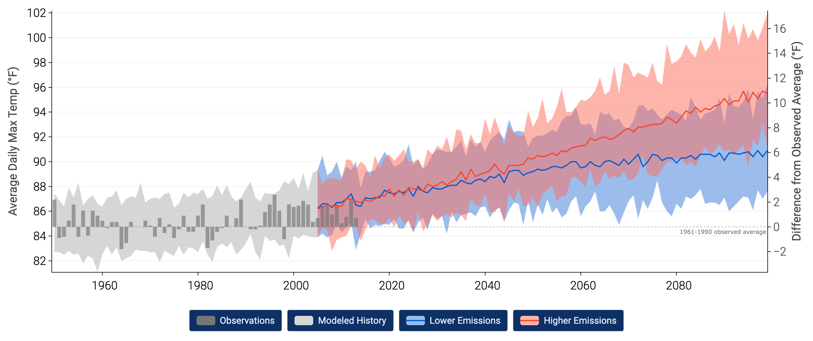
This section presents information on how climate scientists develop scientific predictions about future climate.
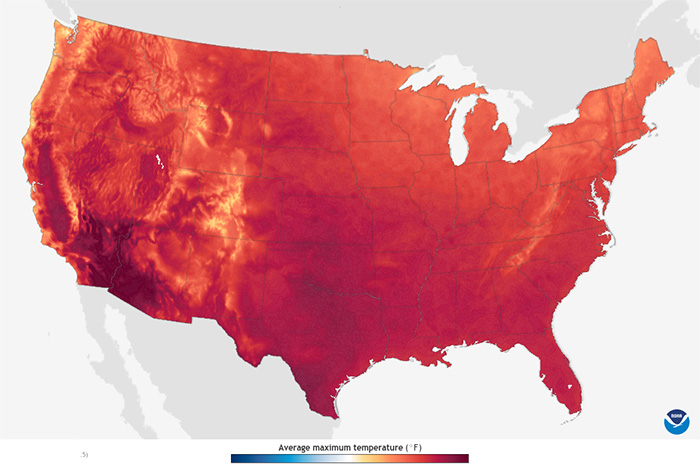
Colors show projected average daily maximum temperature for each month from the 2020s through the 2090s, based on a stabilized-emissions future. In this case, the stabilized-emissions future…
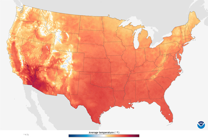
Colors show projected daily average temperature for each month from the 2020s through the 2090s, based on a stabilized-emissions future. In this case, the stabilized-emissions future represents a…
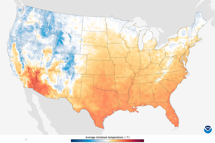
Colors show projected daily average minimum temperature for each month from the 2020s through the 2090s, based on a stabilized-emissions future. In this case, the stabilized-emissions future…