Super-duper (or, El Niño in a warming world)
If you’re reading this, you have surely seen recent predictions that El Niño could break all kinds of records this year, ending up stronger—some say much stronger—than any previous El Niño on record. While a very strong El Niño is essentially a certainty—NOAA recently predicted a 69% chance of an event exceeding any other in our 75-year record—there’s nuance to the story.
A stronger El Niño means we are more likely to see expected El Niño impacts, providing a picture of what upcoming seasons may bring, so it’s important to be able to accurately measure El Niño strength. With climate change involved, however, we need a way to isolate the strength of El Niño itself.
Measure for measure
El Niño’s signature is warmer-than-average water in the central and eastern tropical Pacific Ocean. However, it’s not El Niño without the characteristic atmospheric changes, including weaker trade winds and more rain and clouds over the central Pacific. It’s the atmosphere that communicates El Niño’s impacts on weather and climate around the world, changing rainfall, temperature, and severe weather patterns, so it’s critical that when we measure and predict El Niño, we use a yardstick that can tell us about the atmospheric response.
For the past several decades—since we started regular monitoring and predicting of El Niño in the 1980s—the surface temperature of the central/eastern tropical Pacific Ocean was that yardstick. Specifically, the sea surface temperature anomaly, the difference between the current temperature and the previous 30-year average, in the Niño-3.4 region. The sea surface temperature in this region changes relatively slowly, thus capturing the seasonal El Niño signal instead of short-term weather variations, and is highly predictable months ahead of time using computer climate models.
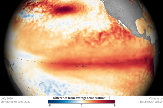
Sea surface temperatures in the Pacific Ocean in July 2026 compared to the 1991-2020 average. Temperatures across the equator were warmer than average (orange, red), a sign that El Niño has emerged. Climate.us image, based on NOAA OISST data.
In recent years, though, warming trends in the tropical oceans have complicated the relationship between the surface temperature in the central tropical Pacific Ocean and the atmospheric response. We were seeing Niño-3.4 index values that looked like strong El Niño, but with weaker atmospheric responses, like 2023–24. On the flip side, relatively weak La Niña events (cooler-than-average sea surface temperature) like 2024–25 were packing stronger atmospheric changes than we’d expect.
So how should we measure El Niño in a warming climate?
Extensive research found that if we looked at the surface temperature anomaly in the Niño-3.4 region relative to the rest of the tropical oceans, the expected atmospheric response matched up much better than if we just look at the Niño-3.4 index. For example, when the Niño-3.4 region is warmer than average, but the rest of the tropics are also warmer than average, the El Niño-related atmospheric response is muted. So there’s our nuance: what really matters for El Niño and La Niña is how much warmer or cooler the central tropical Pacific is compared to the rest of the tropical oceans.
Our old yardstick was telling us whether the El Niño region was warmer than average, but not if it was significantly warmer than other parts of the tropical oceans. Now we made a new yardstick: the Relative Niño-3.4 index, which is the original-flavor Niño-3.4 anomaly minus the average anomaly over the entire tropical oceans. Subtracting out the tropics-wide anomaly helps us understand El Niño’s true strength in a warming world. It’s very likely that this year’s action in the tropical Pacific is El Niño plus some climate change. To get just the ENSO part of the signal, we look at the Relative Niño-3.4 index.
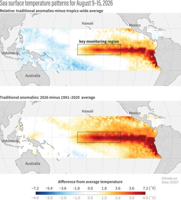
(top) NOAA's new yardstick for measuring the strength of El Niño and La Niña compares sea surface temperatures in the tropical Pacific first to the long-term average (1991-2020) and then to the average anomaly across the whole tropics. (bottom) The original yardstick only compared current temperatures to the long-term average. See the difference? The warm anomaly (red, oranges) in the central/eastern Pacific gets a little weaker—we've removed some of the influence of long-term global warming—but it's more obvious that the area is significantly warmer than the western part of the basin (blue). Climate.us image, based on NOAA OISST data.
NOAA adopted the Relative Niño-3.4 Index as the official metric early this year, and their predictions and historical record reflect this.
Stronger El Niño does mean winter rain, snow, and temperature are more likely to look like the expected pattern. However, as you can see from the strongest events on record, there is always a lot of variety in winter weather! The winters look similar on the large scale—that’s El Niño’s influence—but certainly not identical.
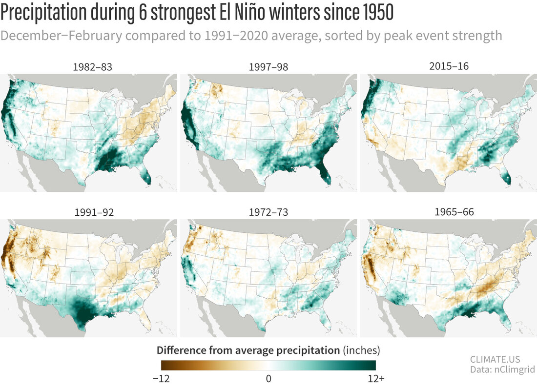
Winter (December–February) precipitation in the contiguous United States compared to the 1991-2020 average for the six strongest El Niño events on record. Green means wetter than average; brown means drier than average. Years are sorted upper left to lower right by peak event strength in any season (not necessarily December–February strength) based on Relative Oceanic Niño Index values.
How do things measure up right now?
Like I said at the beginning, by any metric this is a truly impressive El Niño event. The Relative Niño-3.4 index for July 2026 is in second place in the historical record, behind 1997. For reference, the original-flavor Niño-3.4 index in July 2026 took first place.
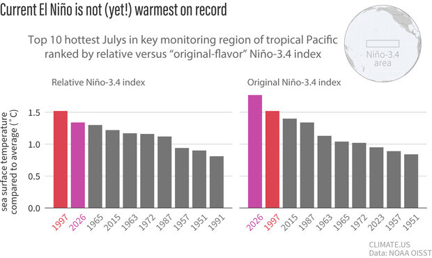
Top 10 highest July sea surface temperature anomalies during past El Niño events. As of July 2026, the current El Niño event (magenta bar) is weaker than the 1997-98 event (red bar) when ranked by the new relative Niño-3.4 index (left). Ranked by the traditional Niño-3.4 index (right), 2026 is stronger, but a part of that is from long-term global warming, not El Niño. Climate.us image, based on analysis by Mike Tippet.
Doing real-time science is challenging, and the Relative Niño-3.4 Index is surely imperfect. However, it’s a big step toward separating out what’s really El Niño in the midst of climate change, a critical issue this year.
What else?
The atmospheric part of El Niño is really bringing it. This map shows the cloudiness over the tropical Pacific. Blue is more, brown is less, and you can see how much cloudier the atmosphere is over those very warm central tropical Pacific waters.
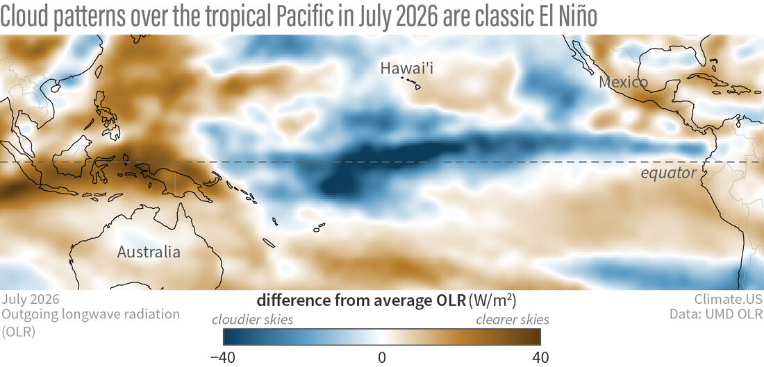
Cloud patterns across the tropical Pacific Ocean in July 2026 compared to the long-term average (1991-2020). Brown areas, such as over the Indonesia and the far western Pacific, mean clearer skies than average. The blue colors dominating the central and eastern Pacific mean cloudier skies than average. This pattern—dry to the west, wet to the east—is a classic sign of El Niño. Climate.us image, based on University of Maryland's outgoing long wave radiation data.
Also, the amount of warmer water under the surface of the tropical Pacific is truly remarkable. Rebecca wrote about this last month, and it’s still going strong in late August.
Finally, there are SO many science questions this El Niño is bringing to the forefront. The central tropical Pacific is already record-warm—while this may not be all due to El Niño, what does this mean for global atmospheric circulation patterns? Beyond the temperature of the tropical Pacific surface, what other roles is climate change playing in this El Niño? The one thing this event is guaranteed to be is an illuminating research topic.
I’m so glad to be writing for the ENSO Blog again, although I can’t begin to say how much I miss the rest of our team. Rebecca and I will be here, chronicling the historical (by any measure!) El Niño of 2026-27, and we’ll bring guest authors, probably a lot of Q&As, and lots more. Stay tuned to Climate.us!